The problem
Being fit is an important goal that many people are aiming towards, but it can be difficult to find the right kind of training and the motivation to be active and put in the effort to exercise on a daily routine.
The solution
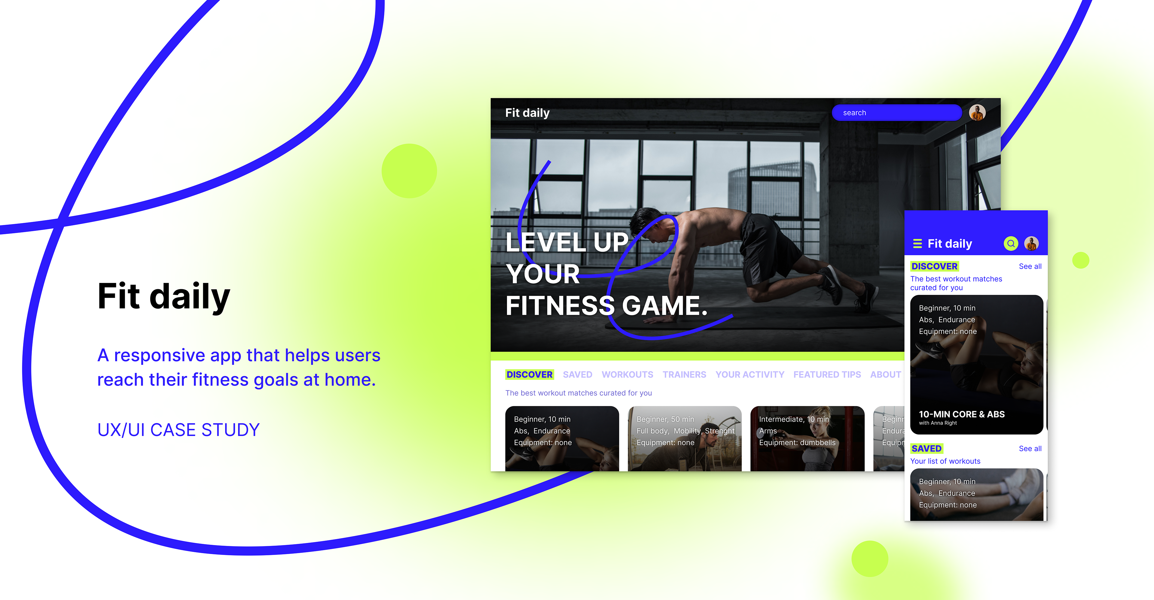
A user friendly, responsive web app that provides users with online training programs and workouts developed by professional fitness figures. Users can get involved in different kinds of training according to their needs or preferences at home, following the daily routine they set up.
Features
- Sign in and create user profile with personal goals criteria
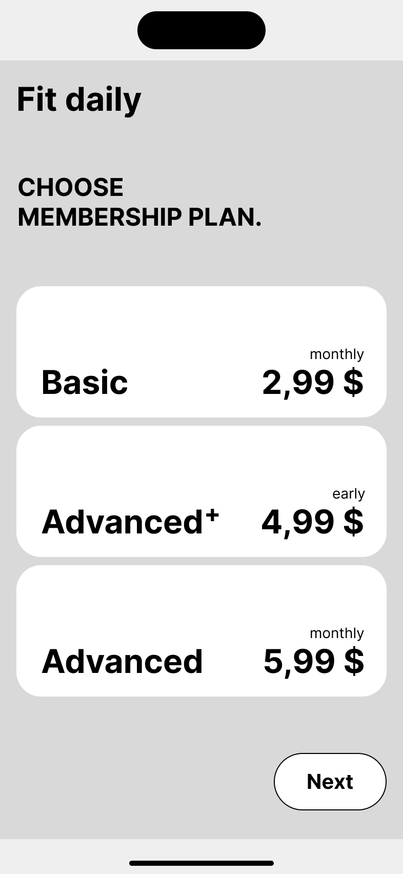
- Choose membership plan
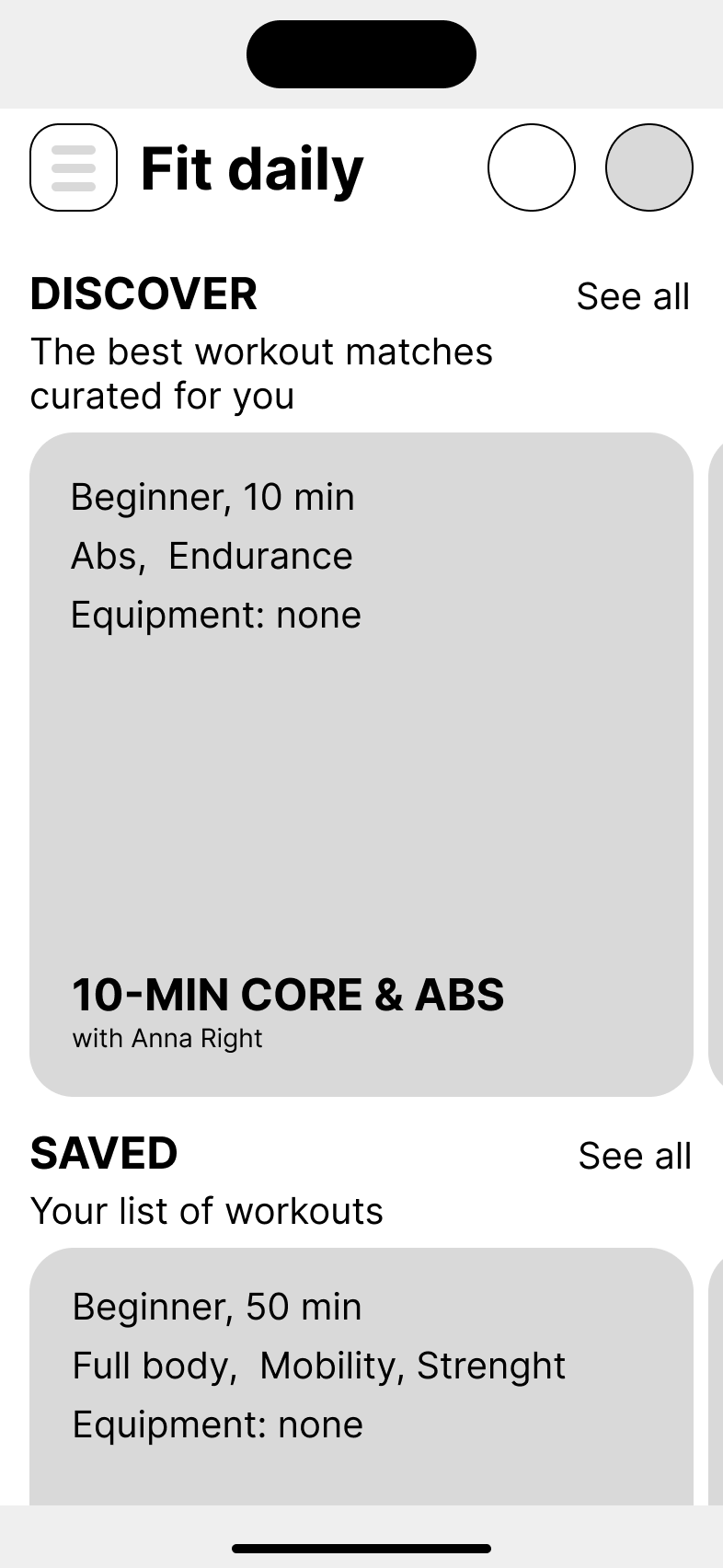
- Get suggestions for programmes and workouts
- Search and filter workouts
- See comprehensive details about a given workout
- Save workouts and programs
- Join workouts / see videos
- Get tips for healthy habits
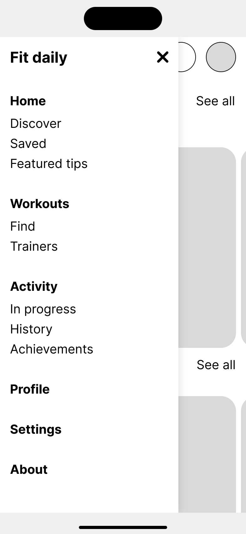
- Profile with activity history and saved programs
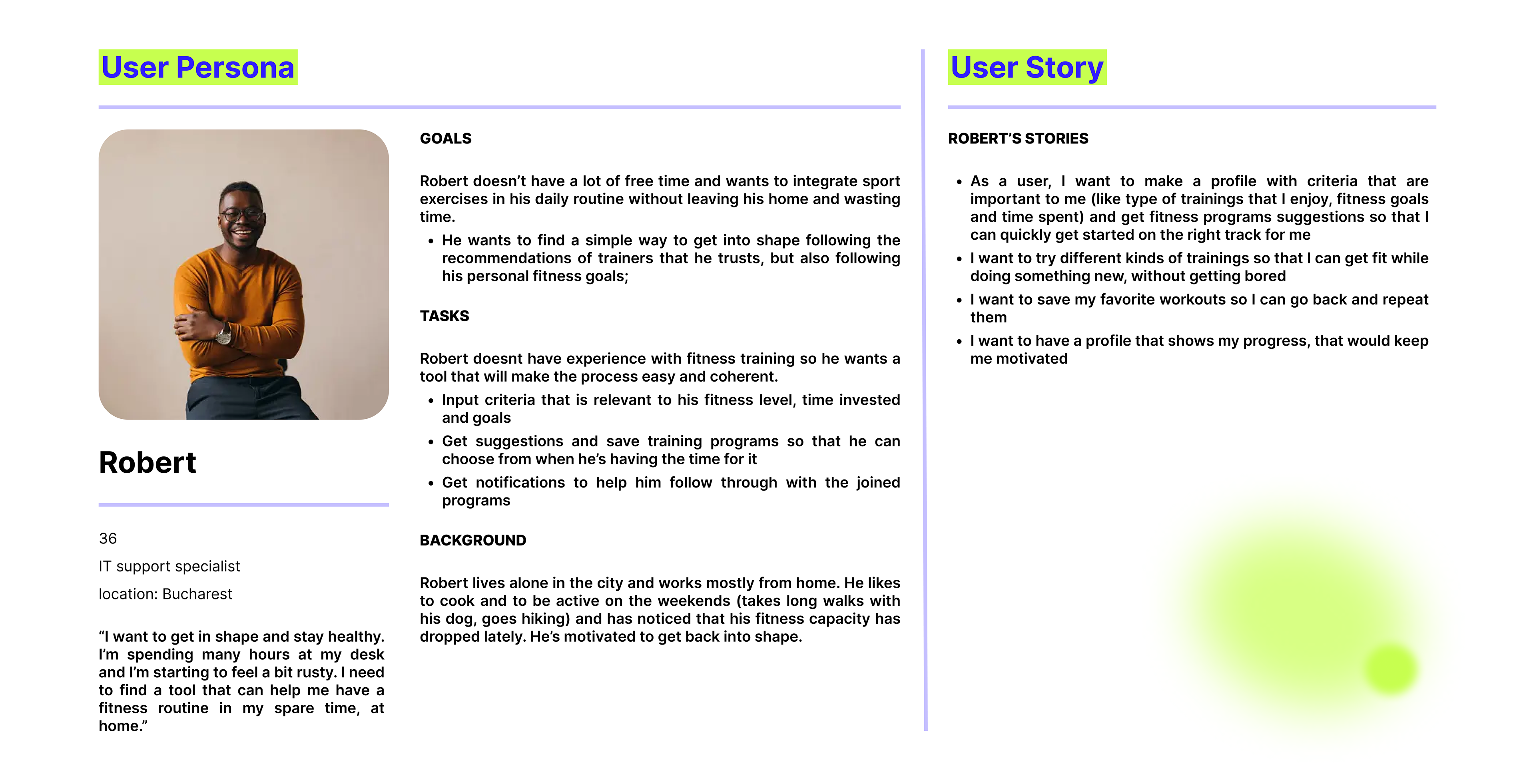
For a better understanding of the home fitness app functionalities, I defined a user persona that matches the targeted user, with clear goals and tasks. The user stories that I created based on their needs and goals helped me to get a more insightful vision about the app’s navigation and architecture.
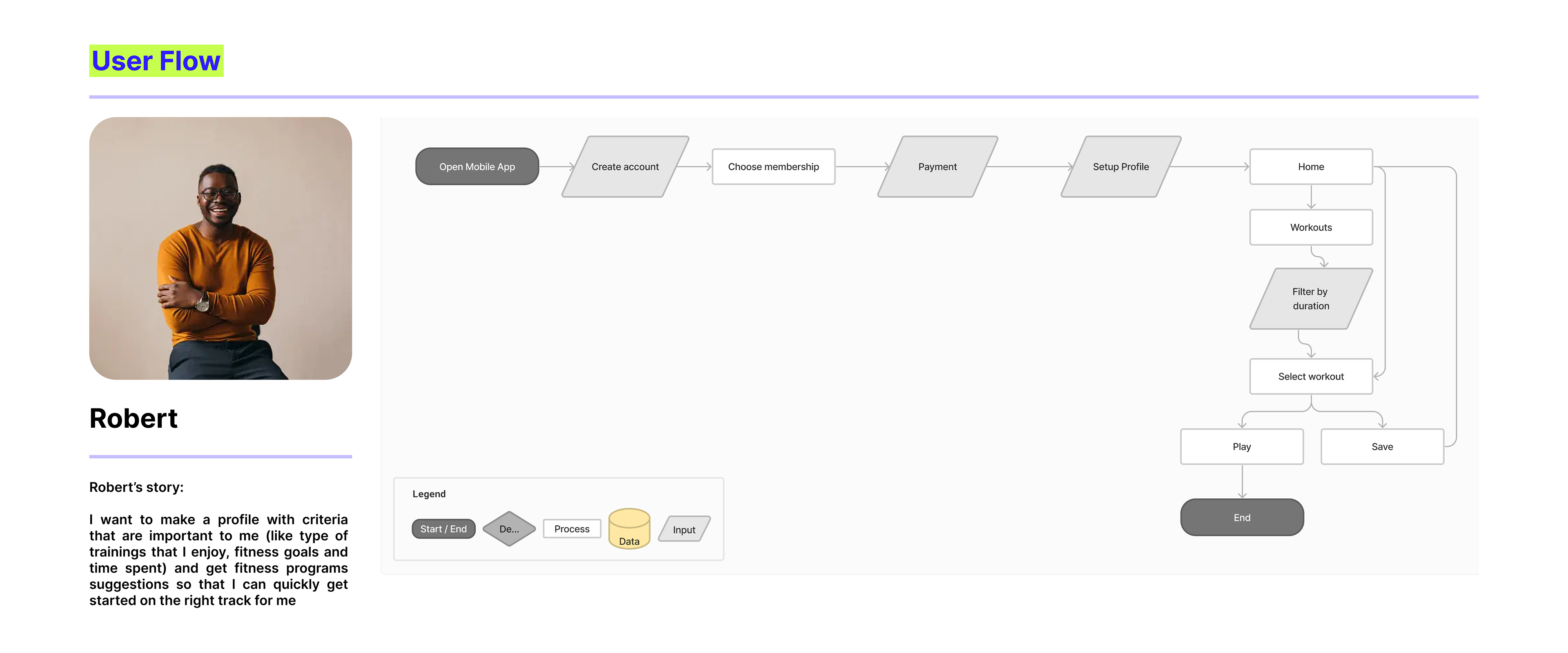
Keeping in mind the user stories of the persona, I developed a user flow . The task of the user was to get started with the app, make a profile and find interesting online workouts to exercise.
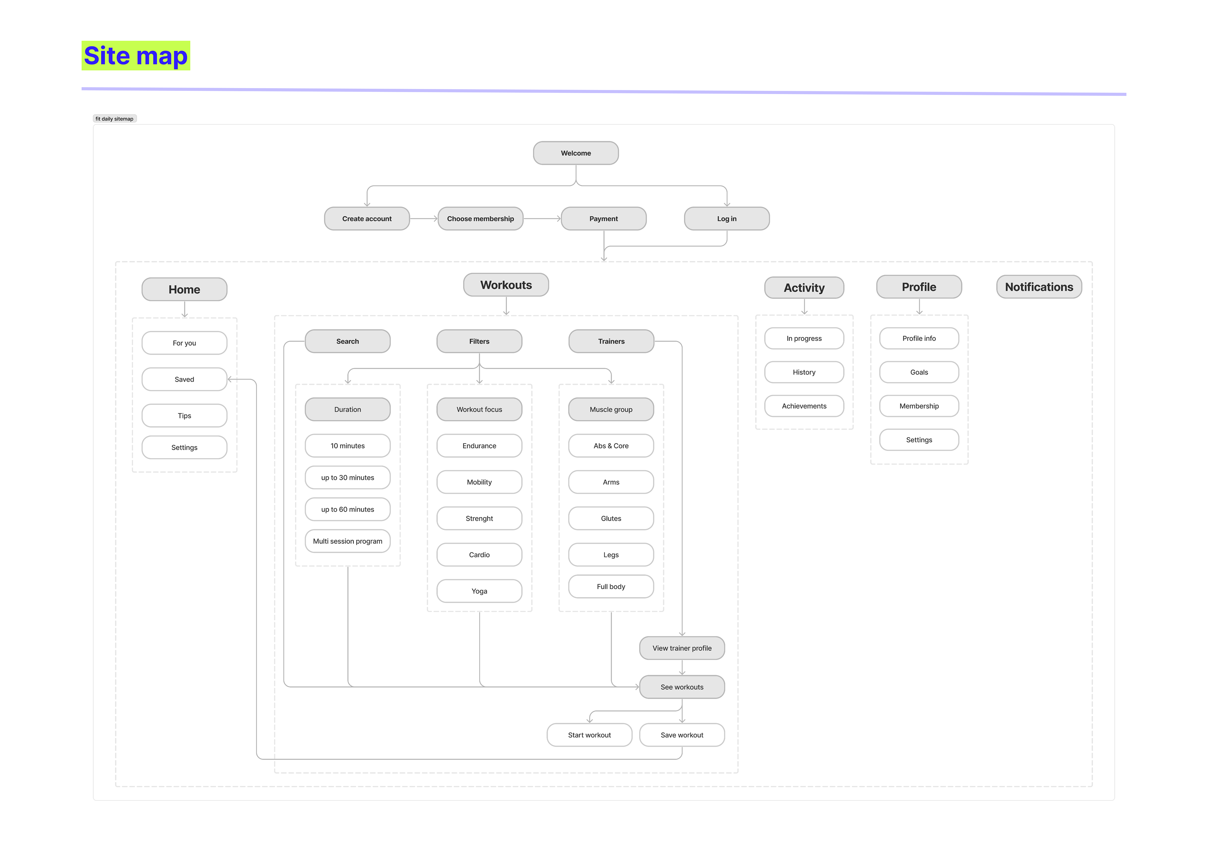
I then considered other functionalities that the app would require and I designed the sitemap.
I started the process of wireframing with a mobile first design approach and taking into consideration that the app will be responsive - and will accommodate a tablet and desktop version.
I first sketched low fidelity wireframes for the user flow - on paper and after I was satisfied with the overall direction of the screens interface I translated them into high fidelity wireframes in figma.


The design refining stage started with picking the most accurate words to describe Fit daily: modern, simple, engaging, dynamic, powerful and impactful.
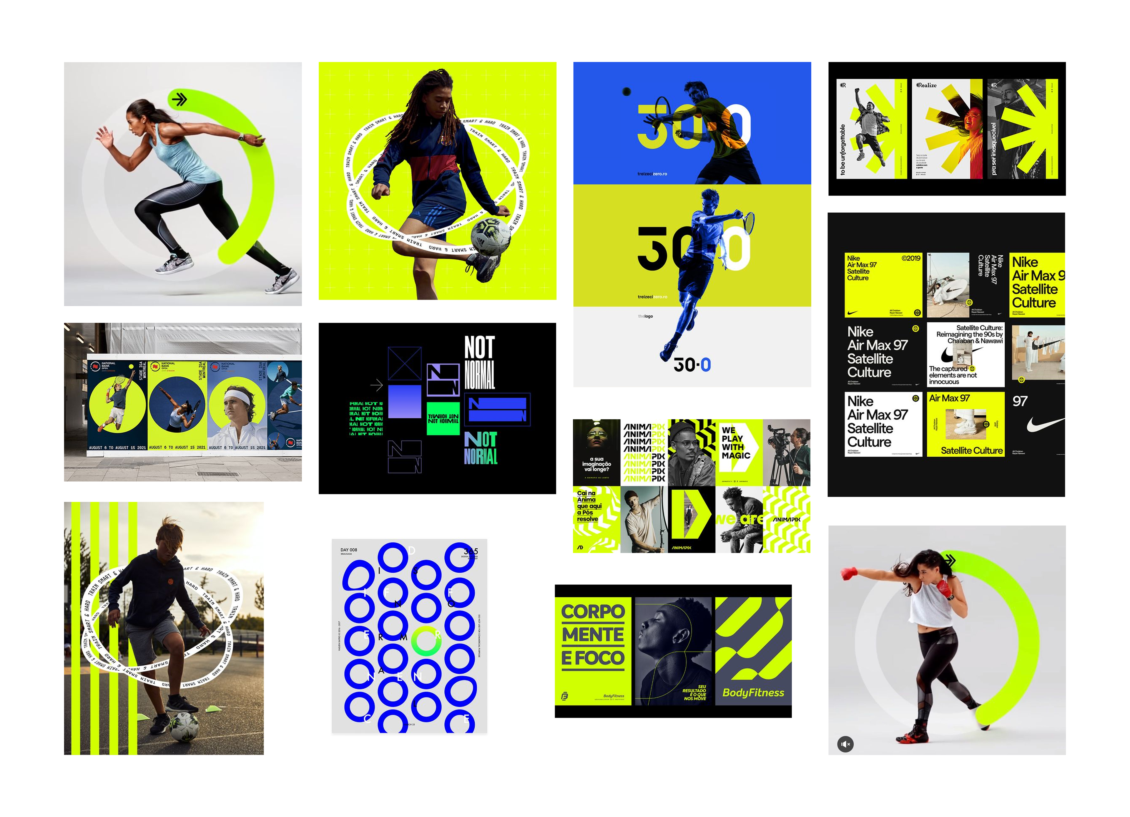
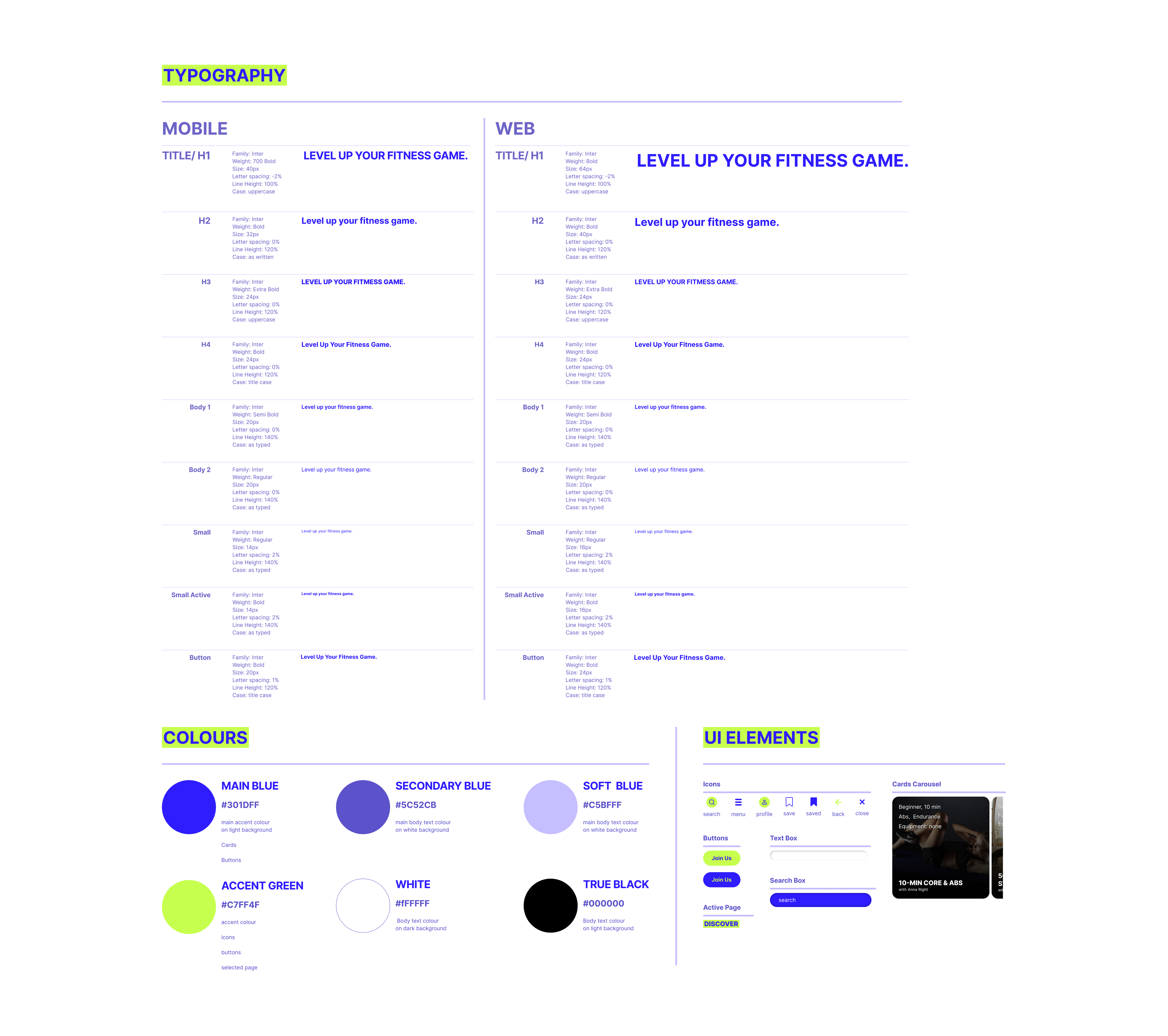
With these in mind, I assembled a moodboard following an online research and went further to develop the Design system that would accommodate all the main UI elements and directions, with general elements and also specific to each type of display used.
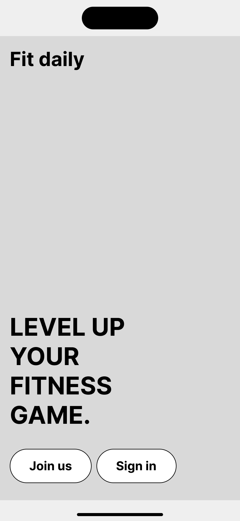
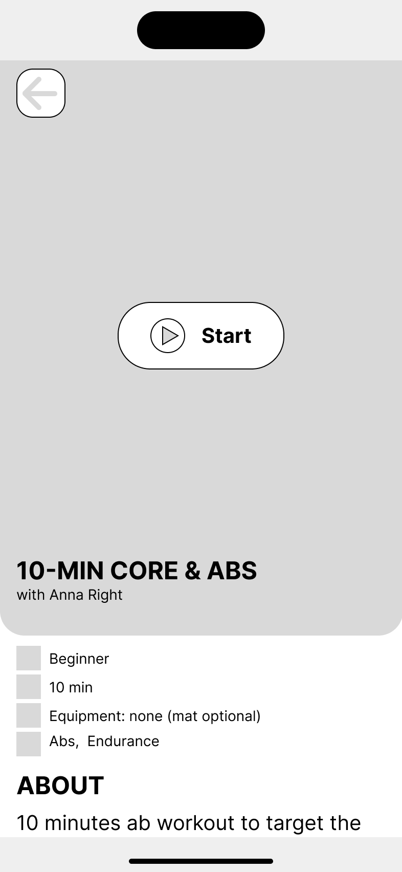
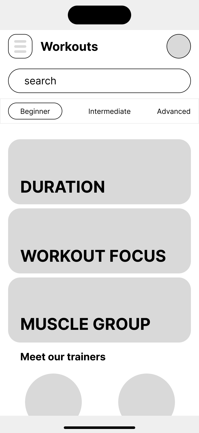
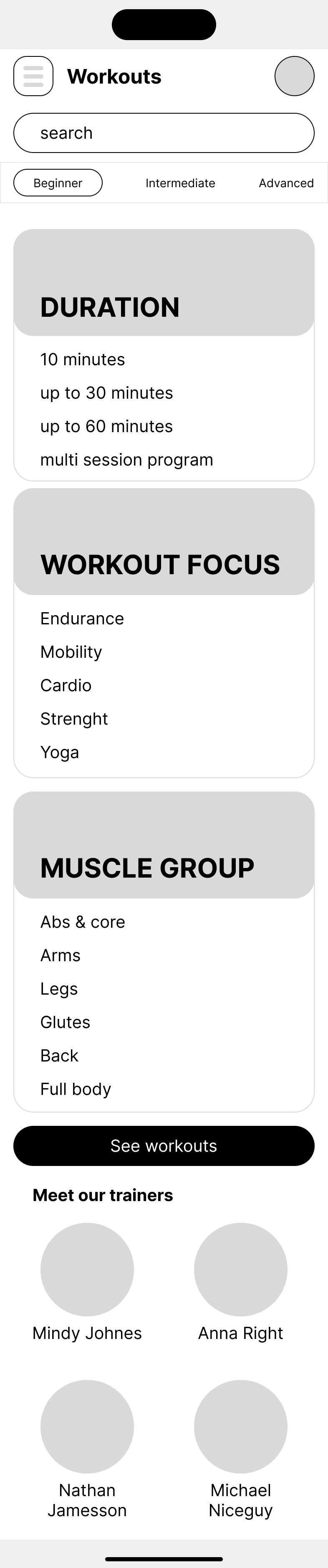
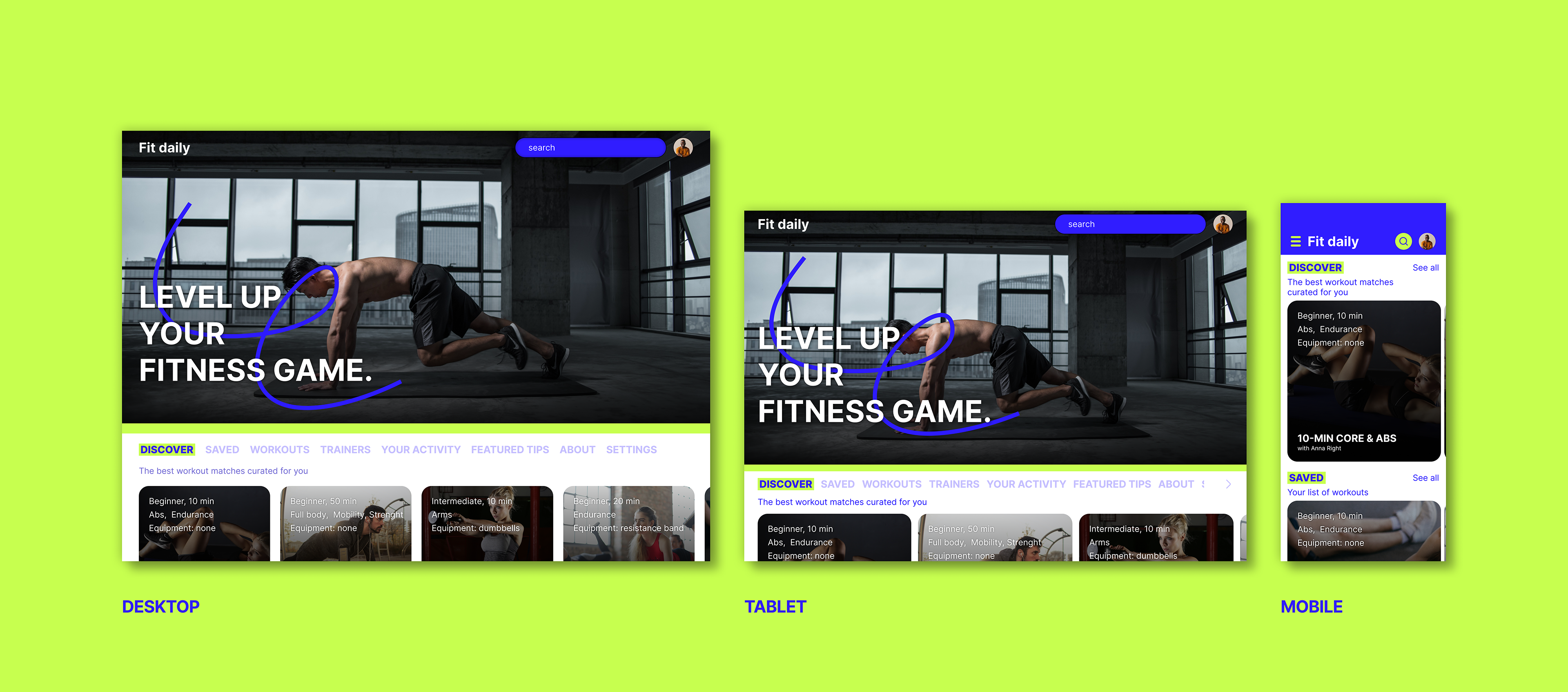
The final mobile design is simple and impactful, using bold typography, contrast and color accents to create a strong visual impact. At the same time, all the elements are well organized following the design principles, for a smooth and engaging user experience.

This is the final mobile prototype:
Next, I designed the different responsive layouts for tablet and desktop, starting with specific grids that have incrementally larger margins and gutters so that the overall proportions of the design will be perceived similarly throughout the different screen sizes. I also used specific typography dimensions and icons resized to suit each layout. After designing everything using figma’s auto layout tool, I used the Breakpoints plugin to test the results and make any adjustments.
Final thoughts
This project was a good exercise to practice my UX/UI skills, with an emphasis on the user interface development and the responsive design process. I focused more on the visual design for this app, rather than the user research methodologies, to strengthen my technical skills.
I started with a mobile first approach to make sure that the most simple layout provides all the key functionalities and maintains a good usability. The larger screens offer the possibility to include more content in one page, and I translated this opportunity into both functional and aesthetical elements, adding a cover image for a bigger visual impact and keeping the content well organized to get an uncrowded, clear user experience.
